Despite the shiny glory of Pinterest, Instagram, Twitter and the Facebook, email is not dead.
According to Marketing Sherpa, email is consumers’ preferred method of communication with business, eclipsing social media. Research by Econsultancy cites 20% of sales can be attributed to the email channel, and McKinsey found email is forty-times as effective as Facebook or Twitter.
Building an email opt-in list and optimizing your call-to-action and capture process is just as important as ever. But how are today’s top online retailers doing?
DON’T: Make email sign-up calls-to-action inconspicuous
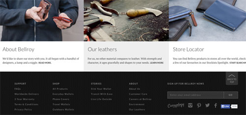
Many, many ecommerce sites minimize their email calls-to-action. Bellroy’s uber-low contrast “ghost” field is buried in its black footer.
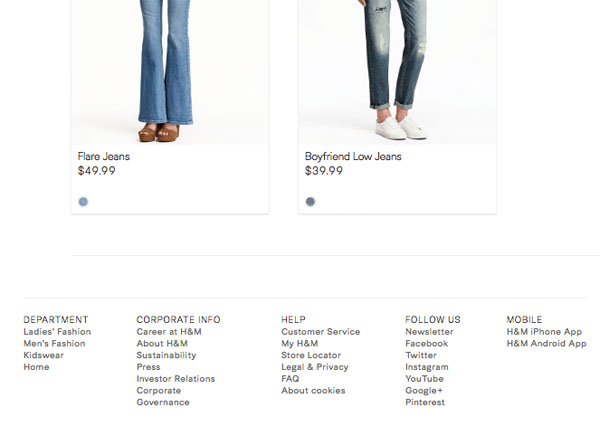
H&M’s newsletter is jumbled with text links for social networks — again in the footer.
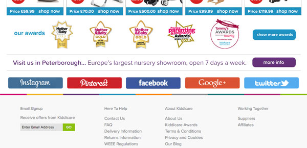
Kiddicare’s social buttons drown out the email sign-up field…in the footer…
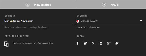
And FarFetch’s “Sign up for our Newsletter” link…doesn’t look clickable.
DO: Test an overlay
Love them or hate them, in-your-face overlays tend to increase opt-ins.
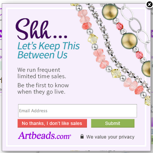
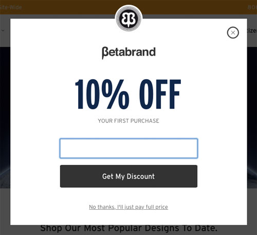
Both Betabrand and Artbeads use the “no thanks” persuasive tactic to make you feel mashugana to decline.
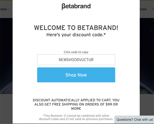
Betabrand’s includes an instant, time-limited offer, eliminating some friction of time-lag between the on-site opt-in and inbox-checking.
If you use this tactic, be sure to test both with/without and different styling/copy of your call-to-action. Testing with visitor segments is also useful (repeat visitors who opt-out in their first visit should not be harassed).
DO: Include your value prop
Why should a visitor give you permissive access to their sacred inbox? What will you do to deserve this access?
Artbeads’ (above) value prop is notification of sales events.
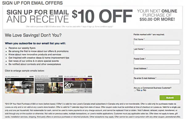
Lowe’s goes into detail (with bullet points!) combined with an offer of $10 off $50+, and provides clickable previews of typical newsletter content.
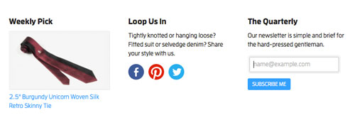
Your value prop doesn’t have to be long…SkinnyTies communicates its newsletters are brief and “suited” to the guy that values his time.
DO: Offer social sign-up
Social log-in pulls the customer’s email address, and may be a more appealing choice.
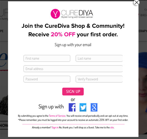
Bonus points: the social-connected customer will often be auto-logged in by the browser on subsequent visits which you can use to personalize the customer journey.
DON’T: Open opt-in in new tab
I spotted this usability snafu on several sites where sign-up opens up in a new tab/page. This is especially bogus on mobile devices.
DO: Allow self-segmentation
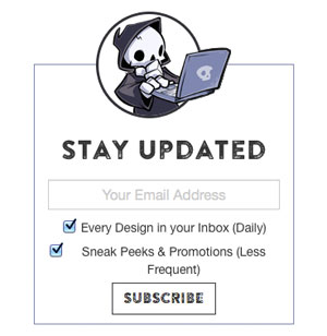
There are several ways to get a jumpstart on your email segmentation. Ript Apparel offers the options of receiving email on every new design daily, promotions, or both.
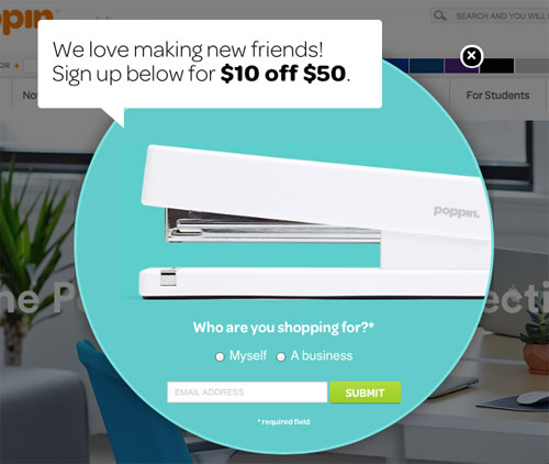
Poppin asks users to identify if they are B2B or B2C customers.
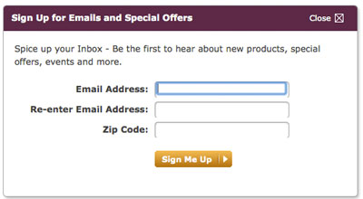
Sur La Table asks for zipcode, a classic demographic segmentation tactic. This can be especially helpful for merchandisers of ecommerce sites with local shops or products that are more suitable to one geography than another (fashion, sporting goods, etc) and helps all marketers get time zone right.
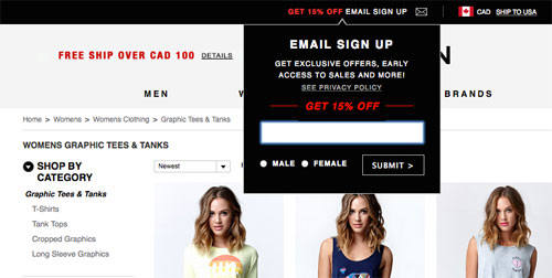
PacSun asks for gender segmentation.
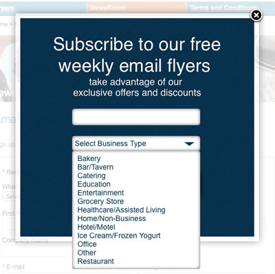
Wasserstrom segments by industry, but be careful with the use of drop-downs.
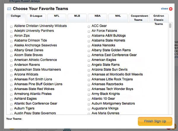
Fanatics has the most fanatical segmentation options, but it suits its business.
DON’T: Ask for too personal/sensitive information
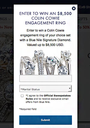
Blue Nile boldly requests marital or engagement status, which is a risky approach to segmenting their customer. Engagement status, like pregnancy, can change suddenly without a marketer’s knowledge, for which continuing to target on as if they are still engaged or pregnant can be insensitive-to-offensive.
DO: Offer preferences after sign-up
You may choose to get the email address quickly and painlessly first, then direct your subscriber to a preferences page or light-box, like Land’s End.

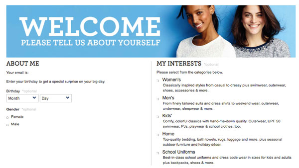
Sending to a new page may encourage abandonment, so make sure there’s a clear “exit to keep shopping” option.
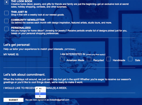
Make sure your preferences section isn’t too overwhelming and detailed, however. The “don’t make me think” rule still applies universally to web usability (e.g. light-on-dark text and ALLCAPS can be hard to read).
DO: Explain the value prop for sharing more information
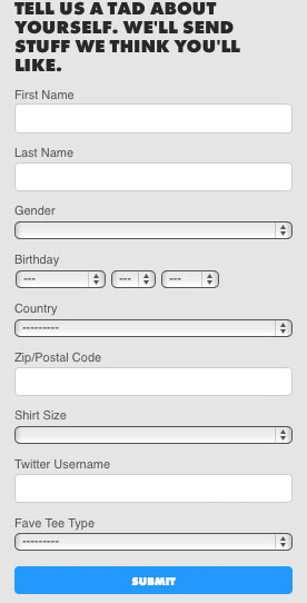
Threadless’ “we’ll send you stuff we think you’ll like” is a bit of encouragement to share more…
DO: Indicate required fields
If you’re going to use a form in email sign-up, indicate which fields are optional (Threadless didn’t).
Keep in mind, however, that showing more fields than just “enter email” visually adds to the perceived difficulty of the form – even with asterisks. (This is a borderline “don’t” – worth testing).
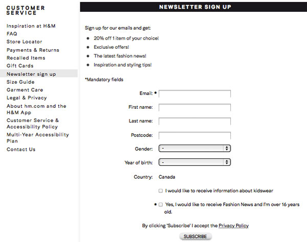
Ideally, when asking for additional information, a one-liner explaining how this information will be used to send more relevant emails and content is more persuasive.
DO: Cover the legals
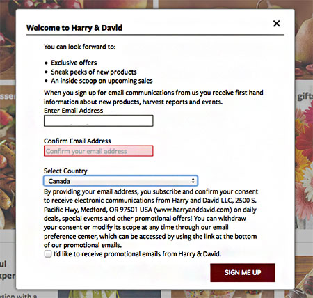
Harry and David observes Canada’s anti-spam legislation by gleaning express consent from Canadian subscribers.
DON’T: Ask for too much information
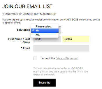
As with all online forms connected to a conversion goal, the more you ask for, the more you risk abandonment.What you ask for may also be a factor. This form excludes “Mrs.” and “Miss” as a salutation. Salutation itself is questionably required.
DO: Check field usability
If you are going to ask for segmentation input like birth date, ensure fields don’t wipe context once the user starts typing. In this case, date format disappears and doesn’t return, which can lead to errors.
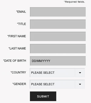
Test your fields with deliberate mistakes. Like with checkout, your error handling should be very clear and conspicuous. This example is not.
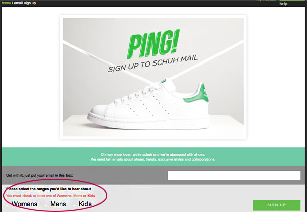
DON’T: Neglect CTA rules
Call-to-action design rules apply to all forms and conversion goals:
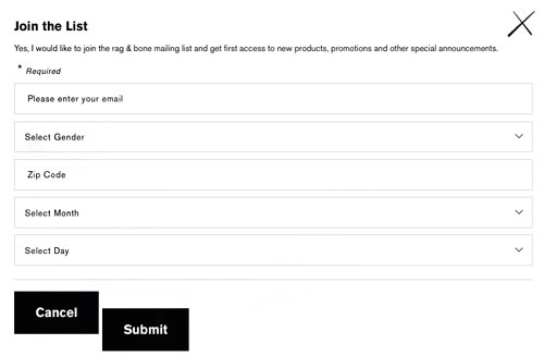
1. Avoid “cancel” buttons, and if you use them, style them less prominently than “submit.”
2. Avoid the word “submit” where possible, it’s just as simple to use more descriptive and fun “Sign Me Up” or “Subscribe.”
3. Test CTAs in various browsers, and ensure they align properly
DO: Provide visual feedback
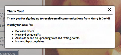
Harry and David leverage a thank-you page to reinforce the value prop of subscribing, while reducing multiple submissions and customer unsure-ness.
DO: Link to a preference center after capturing the email address
If you want to simplify your sign-up while still capturing valuable segmentation information, consider getting the email first, then link to a preference center (or take the subscriber directly to it with an easy exit).

DO: offer a mobile opt-in
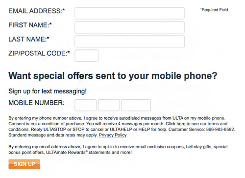
You can’t build a mobile marketing list if you don’t ask. Ulta takes advantage of the customer in the sign-up mindset.
DO: Ask for social sharing
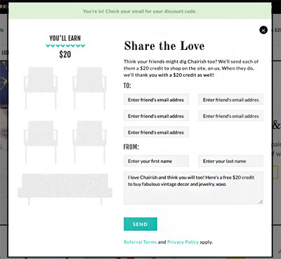
Likewise, Chairish incentivizes email-a-friend at the very moment the subscriber is thinking about email.
This is the first of a 3-part series on retail email marketing. Next post, we’ll explore the wild world of welcome emails…
